
Purple Paper Press
A Vibrant Evolution of Art & Legacy
Brand
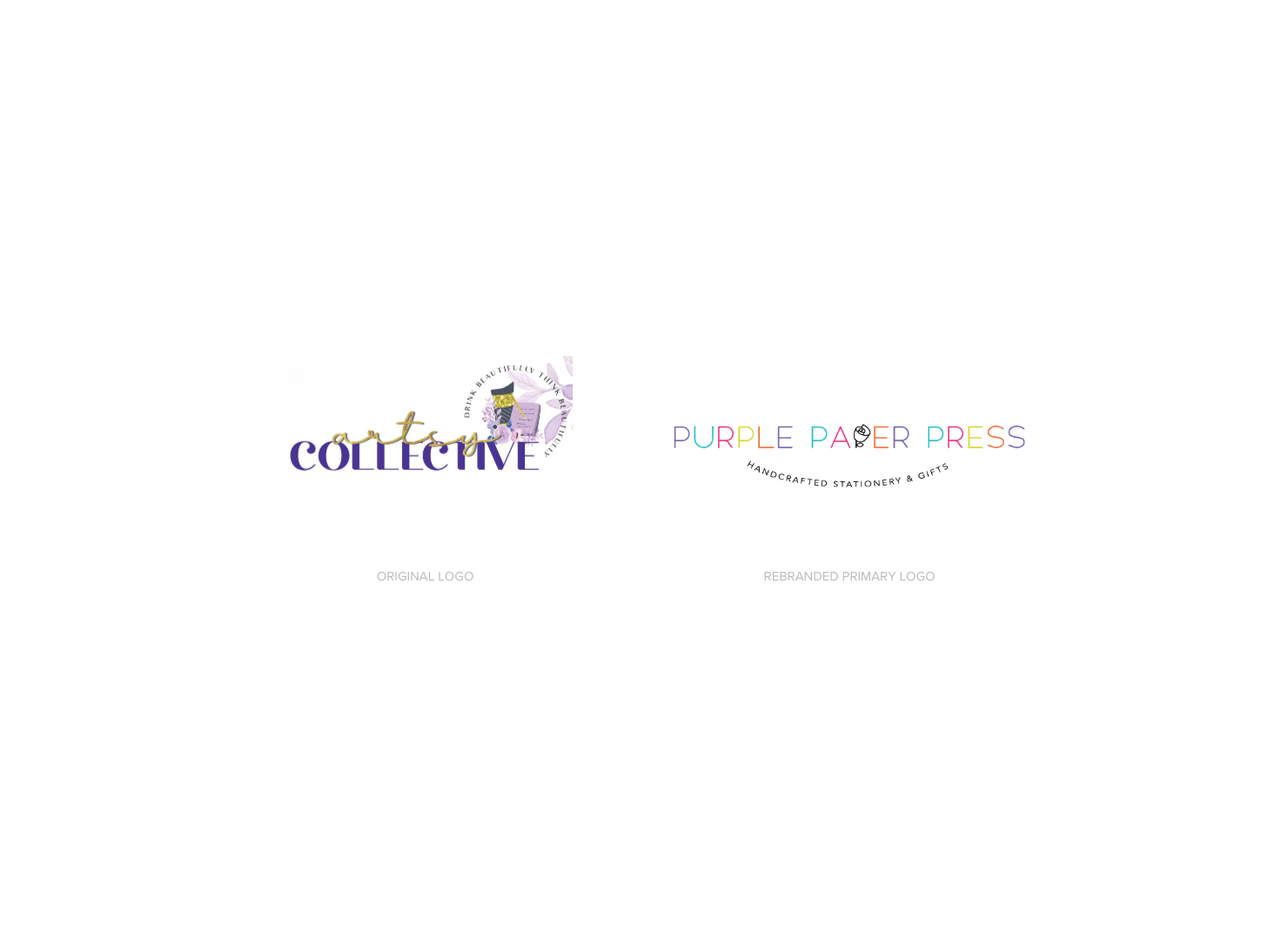
Artsy Collective began with African American art on tumblers and mugs but lost its vibrant essence and signature purple as it expanded. Rebranding as Purple Paper Press realigned it with its true identity and purpose.
Project
Brand Strategy & Name Evolution
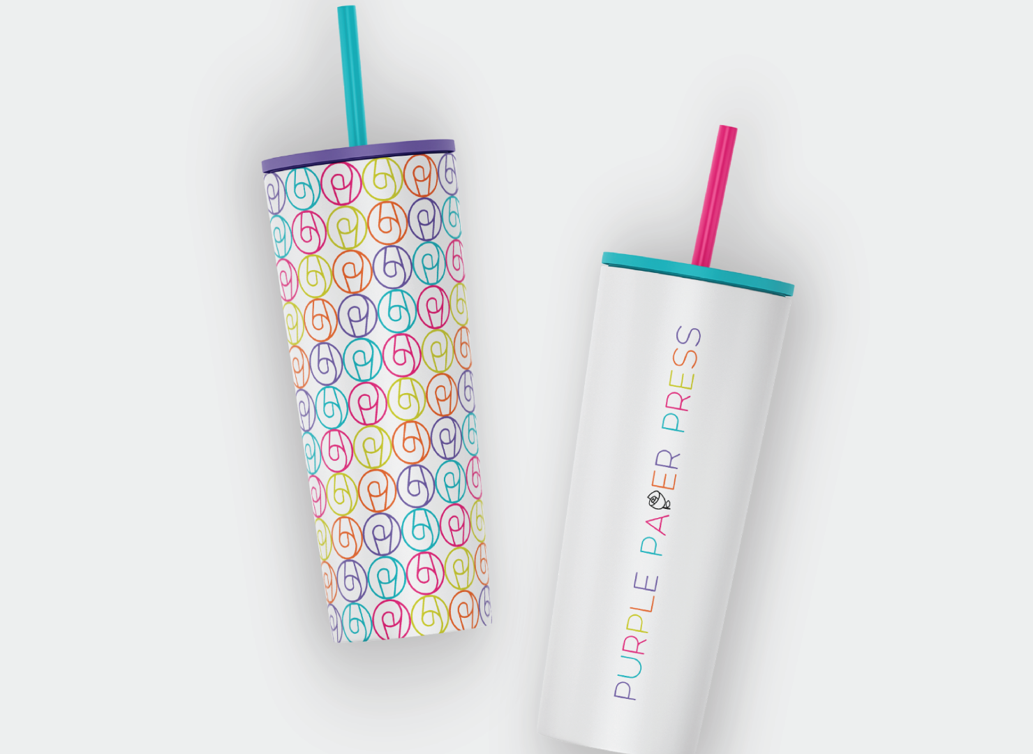
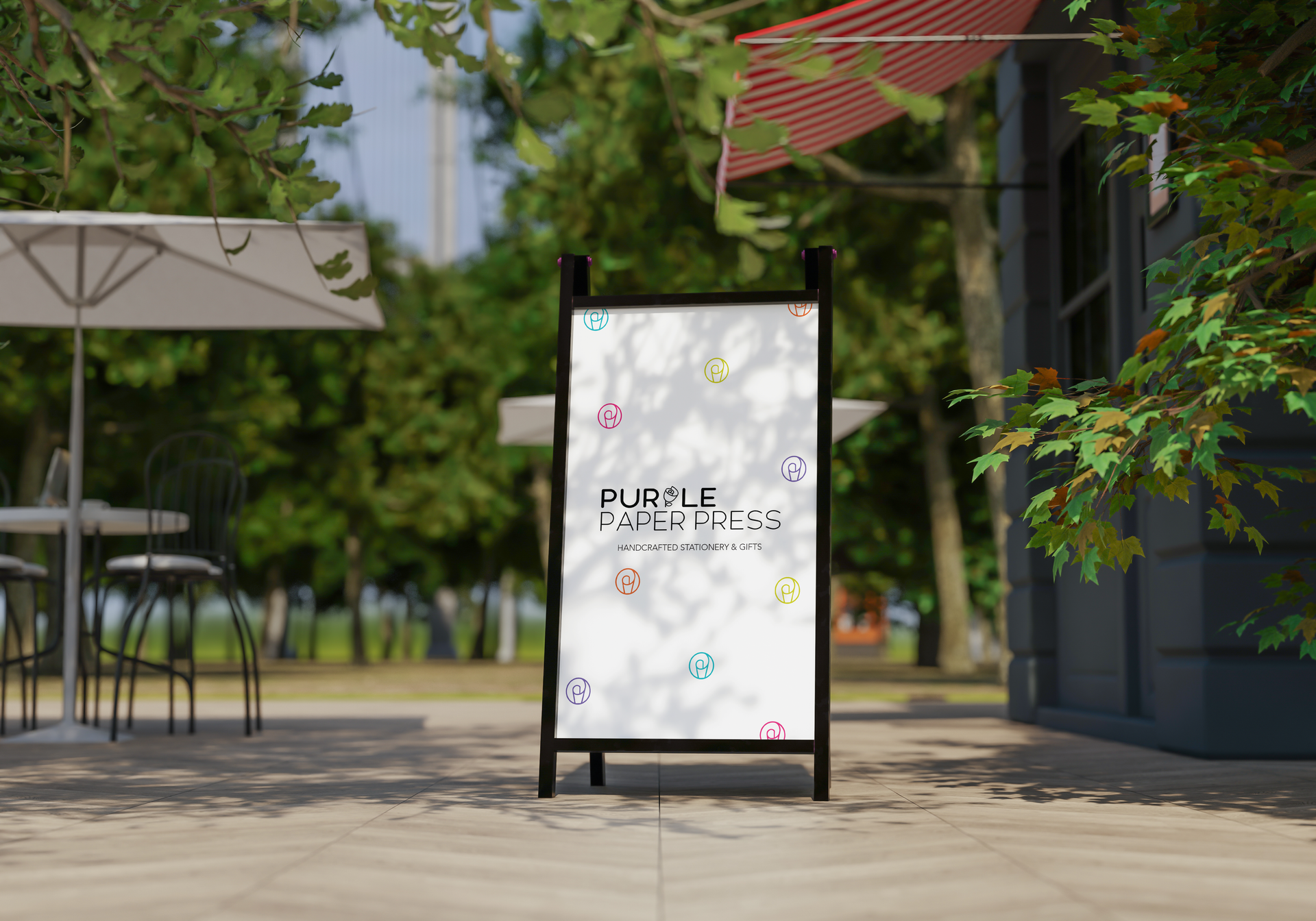
Logo + Identity Systems
Iconography + Collateral Designs
Brand Style Guides
Industry
Retail & Stationery
THE CHALLENGE
As the product line grew, its visual identity no longer reflected its cultural depth or family heritage. The challenge was to redefine its essence while ensuring cohesion, creativity, and adaptability in a dynamic market.
THE APPROACH
We created a bold, multicolored sans-serif wordmark to capture the brand’s vibrancy and creativity. A custom paper rose brandmark symbolizes growth and artistry, while the rebrand brought clarity and cohesion to its renewed vision.
THE RESULTS & IMPACT
The transformation into
Purple Paper Press revitalized the brand’s presence, creating a
stronger, more authentic connection with its audience. The new identity extends into:
✔
Developed a vibrant, multicolored wordmark that reflects creativity and artistic legacy.
✔
Designed a signature paper rose brandmark symbolizing growth, transformation, and heritage.
✔
Created a cohesive visual identity that unifies the expanded product line.
✔
Established brand guidelines to ensure consistency across digital, packaging, and promotional materials.
With this rebranding, Purple Paper Press now stands as a bold and culturally rich brand, blending art, legacy, and innovation while staying deeply connected to its roots.

Curious where your brand stands? Take the Brand Clarity Scorecard and find out.
© 2024 All Rights Reserved | Dannan Creative Based in Phoenix, AZ & Beyond | hello@dannancreative.co | Photography by Roshan | Privacy Policy | Terms & Conditions