
PreeJs
Infusing Playfulness & Excitement into Intimate Care
Brand
PreeJs, a playful brand of scented and flavored wet wipes, adds excitement to intimate moments. It sought a bold identity to reflect its fun, daring spirit.
Project
Brand Strategy
Logo + Identity Systems
Iconography + Collateral Designs
Brand Style Guides
Industry
Personal Care & Intimacy Products
THE CHALLENGE
PreeJs needed a logo and visual identity that stood out in a crowded market while appealing to a broad demographic of sexually active adults (ages 20-49). The challenge was to create a bold and playful brand that balanced fun, excitement, and cleanliness while ensuring instant brand recognition across packaging and social media.
THE APPROACH
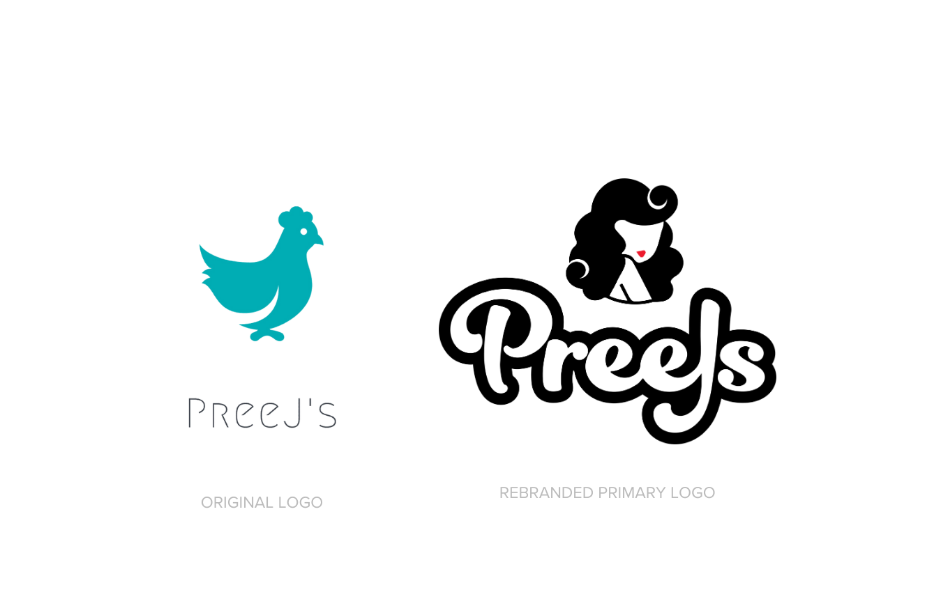
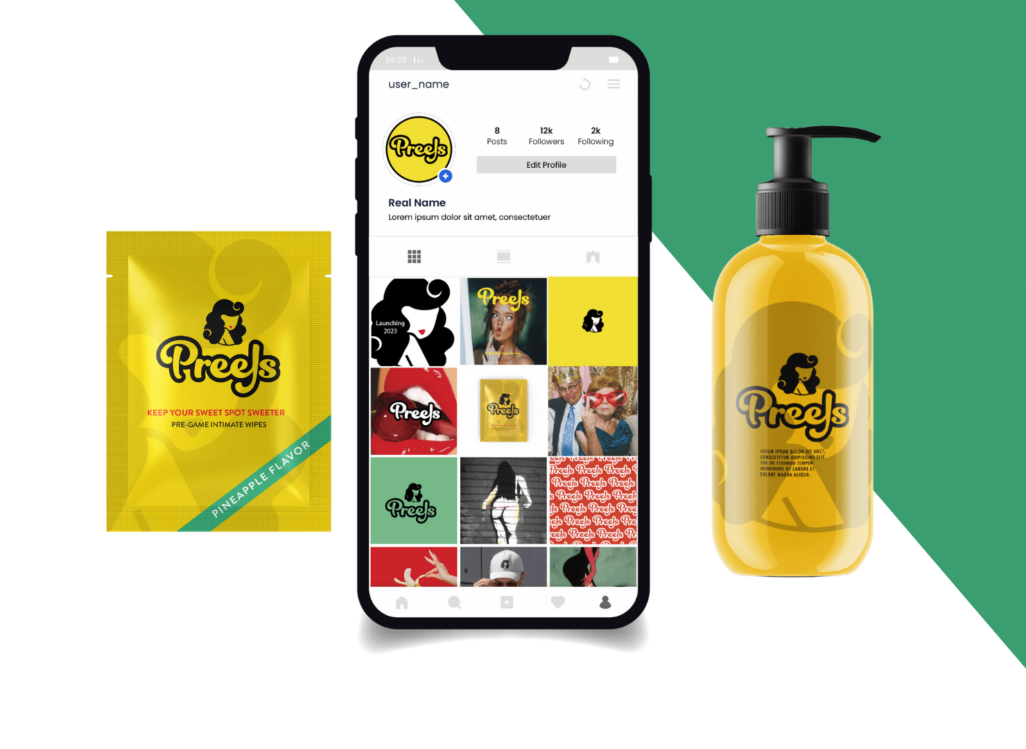
We developed a striking brand identity that embodies the flirty, adventurous essence of PreeJs. The red lips in the logo stand out against a black-and-white pin-up girl, creating a captivating focal point that exudes energy and allure. The vibrant packaging in red, green, and yellow further reinforces the brand’s lively and playful personality, ensuring it commands attention both online and on store shelves.

THE RESULTS & IMPACT
The final
PreeJs identity is a bold and unapologetic
celebration of intimacy, fun, and confidence, setting the brand apart in the intimate care space. This brand transformation extends into:
✔
Designed a bold, eye-catching logo that exudes excitement and energy.
✔
Created a playful visual identity that resonates with a diverse, fun-loving audience.
✔
Developed striking packaging design with vibrant colors for maximum shelf appeal.
✔
Established brand guidelines to ensure cohesive messaging and recognition across platforms.
With this bold and playful identity, PreeJs is positioned to excite and engage its audience, bringing joy and confidence to intimate moments.

Curious where your brand stands? Take the Brand Clarity Scorecard and find out.
© 2024 All Rights Reserved | Dannan Creative Based in Phoenix, AZ & Beyond | hello@dannancreative.co | Photography by Roshan | Privacy Policy | Terms & Conditions